Color Survival Guide and the Super Color Generator
A complete walkthrough of RGB, HSL, CMYK, Display P3, LAB, and more, paired with Surfing Super Color Generator workflows that help developers, designers, and presenters collaborate on color.
Why We Should Care About Color
A designer ships a dazzling visual comp, yet once it goes live the colors look muted, washed out, or completely different on Safari versus an Android phone. Sound familiar? As long as we treat color as “the designer’s business,” we’ll never deliver a consistent brand experience. For frontend engineers, UI designers, slide creators, and all the hardworking folks in between, understanding color models and knowing how to collaborate around them is the key to making UIs, product pages, and decks look right.
We’ll tackle this in two parts. First we’ll recap the color models you encounter most often. Then we’ll look at the Surfing Super Color Generator—a tool built to resolve everyday color headaches—and see how it turns knowledge into practical workflows while boosting efficiency and implementation quality.
Start with Three Keywords: Gamut, Color Space, and Color Notation
Before we talk tools, let’s revisit how we perceive and describe color. Most of us have heard of the “three primaries,” and they come in two systems: additive primaries (red, green, blue—RGB) and subtractive primaries (cyan, magenta, yellow—CMY). Additive primaries blend into brighter colors and ultimately white, so they’re used for screens. Subtractive primaries absorb light and get darker, ending in black—hence the extra black ink channel we add in printing to form CMYK.
It’s interesting that traditional art education still teaches the red-yellow-blue primaries. That convention comes from history and habit, but it can’t mix magenta or cyan, so modern printing has long replaced it with the more accurate CMY set.
We perceive color because the cone cells in our retinas are broadly tuned to red, green, and blue wavelengths—hence the additive primaries. Cats and dogs are dichromats, seeing mainly blue and yellow. Dolphins, despite their smarts, have only one type of cone and are essentially monochromats. Bulls don’t perceive red; they charge at the movement of the cape, not the hue itself. Because our perception depends on how cones respond to light, “the blue you see may not be the blue I see.”
Human understanding of color has two layers: the sensory layer of how the cones, eyes, and brain react to the spectrum, and the communication layer of how we describe and reproduce color. A few key concepts keep showing up around those layers:
- Gamut: The range of colors a device or standard can reproduce. Think of it as the objective universe of colors, independent of any specific medium.
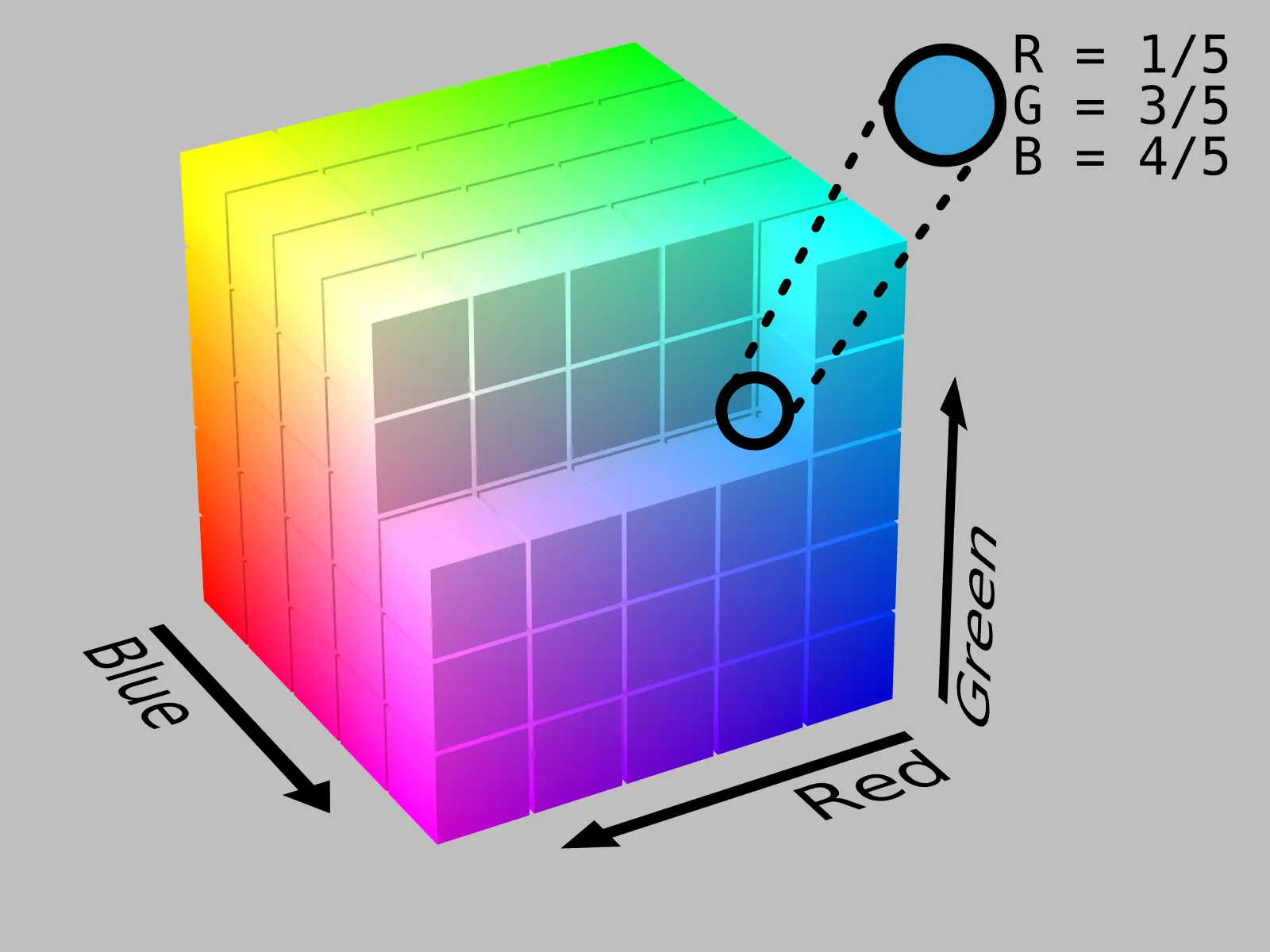
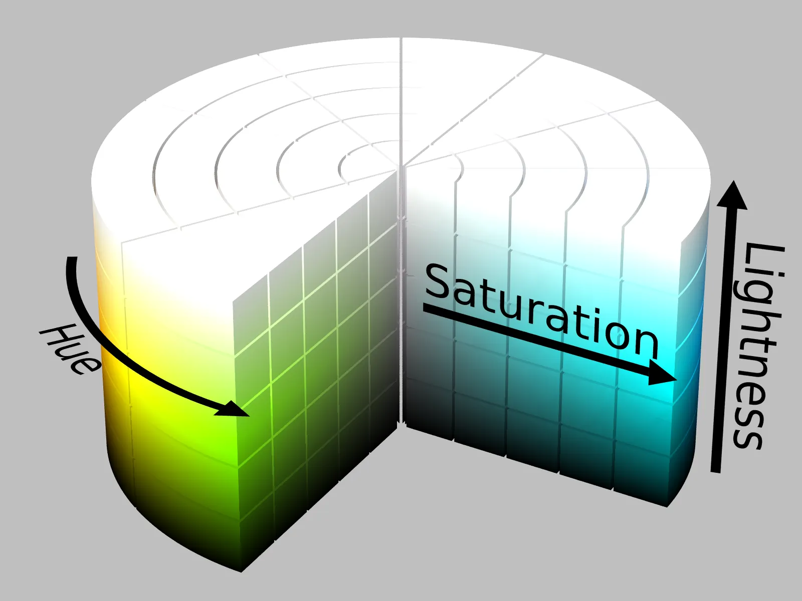
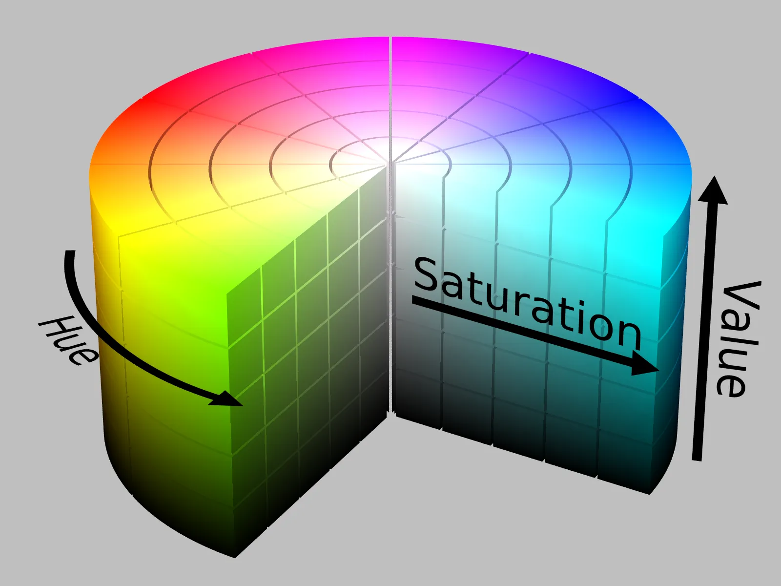
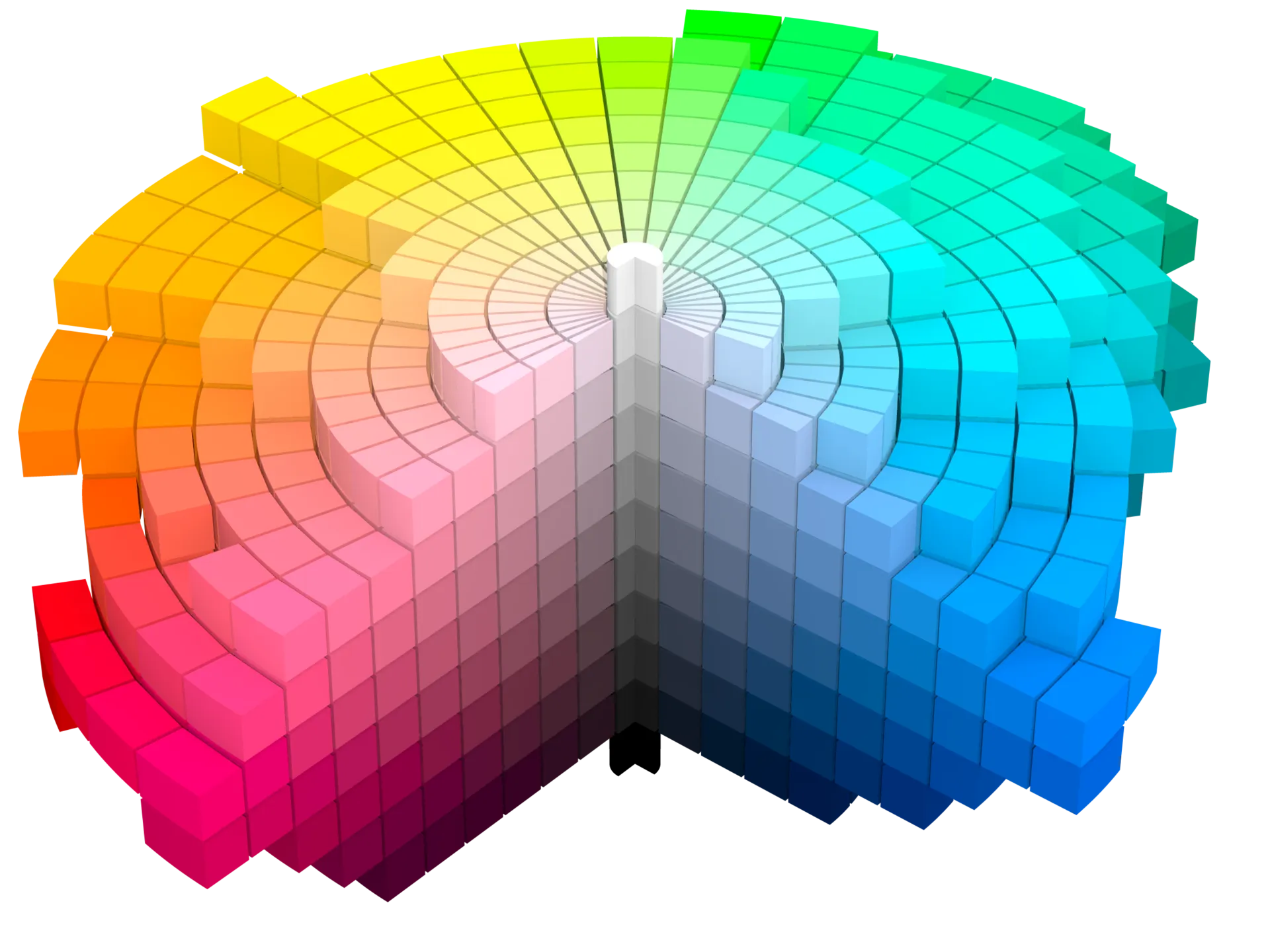
- Color Space: A coordinate system agreed upon for communication, mapping colors within a gamut. RGB’s cube and HSL’s cylinder are classic examples.
- Color Notation: The encoding within a given color space. CSS Hex,
rgb(), andhsl()are familiar examples. As CSS evolves toward Color Level 4, we gaincolor(),lch(),oklab(), and other syntaxes for wider gamuts.[4] - Color Model: The abstraction behind a notation, defining the dimensions and rules. RGB, CMYK, and HSL are all color models.
- Color Theory: The discipline that studies mixing, contrast, balance, and harmony.[7]
- Delta E: A metric for color difference. Different color spaces yield different Delta E calculations.
These all point to gamut, color space, and color model as the core trio. MDN’s color documentation includes the classic CIE 1931 chromaticity diagram (below), showing the horseshoe-shaped gamut of human vision versus the triangles devices can render. Chrome’s High-Definition CSS Color Guide notes that the traditional sRGB triangle covers only about 30% of what we can see.[1]
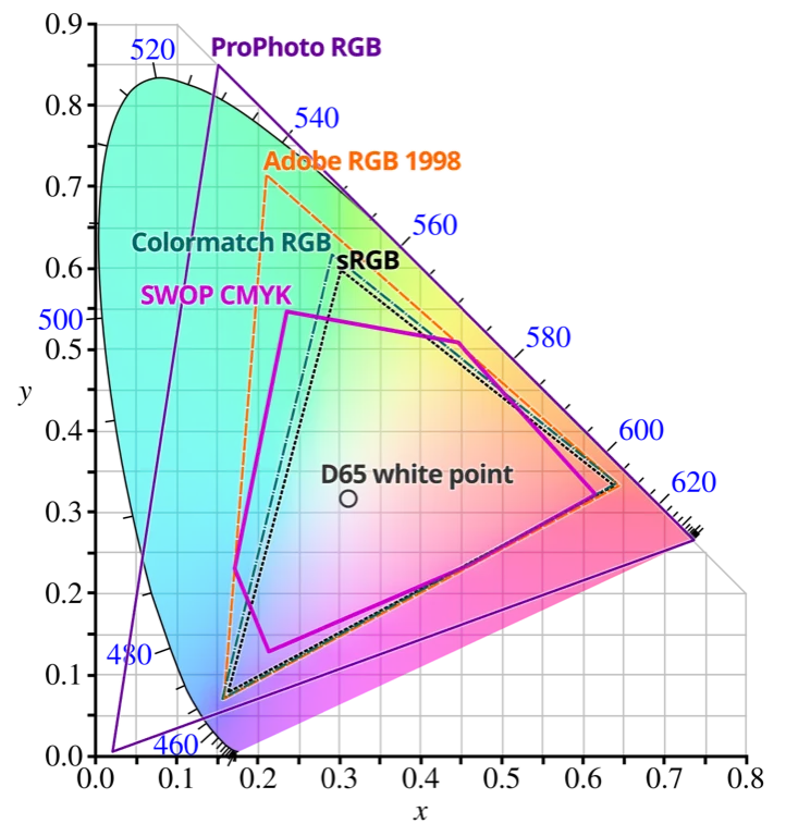
Perception may be innate, but knowledge is built. Color spaces give us mathematical models for describing the attributes and relationships of color. Which space you pick depends on the application: sRGB for the web, CMYK for print, Rec.709 or Rec.2020 for video, and so on.
Color Spaces and How They Interconvert
In practical frontend collaboration, think of color as a pipeline: confirm the target gamut (sRGB only or extending to Display P3), agree on the working color space (RGB, HSL, LAB, etc.), and decide how the code will encode the values. With that pipeline in place, cross-device display, wide-gamut assets, and chart palettes all have a shared foundation, and “we couldn’t reproduce the design” stops being an excuse.
Once that pipeline is clear, the color model becomes the blueprint for how a specific space encodes colors. One model typically maps to one space, and the space dictates the notations available—RGB’s Cartesian cube yields rgb() and Hex, HSL’s cylinder gives us hsl()/hsla(), and so on. For each model we’ll follow the same playbook: understand the model, see how the space and notation connect, and note the engineering gotchas.
A Brief History of Common Color Spaces
If color spaces are maps, then the coordinate systems we rely on are the trails blazed by earlier explorers. In the 1930s the CIE introduced the CIE 1931 chromaticity diagram, essentially drawing the “geographical boundaries” of visible light and becoming the starting point for gamut discussions.[3] Jump to 1996, when Microsoft and HP proposed the sRGB standard, giving displays, operating systems, and early web graphics a shared baseline—and letting frontend engineers and UI designers pass colors across devices reliably.[3][4]
Next came Adobe RGB in 1998, expanding coverage—especially greener cyans—for the print world. In 2015 Apple brought the film industry’s DCI-P3 gamut to consumer hardware with Display P3, turning it into the hot topic in wide-gamut debates.[4] Looking ahead we have Rec.2020/BT.2100, targeting HDR and 8K. It hasn’t fully landed on the web yet, but anyone building presentations or video content should keep an eye on it.[4]
This timeline mirrors how collaboration practices have evolved. UI designers choose display gamuts in Figma, developers implement fallbacks in code, and slide creators verify whether the projector supports the same standards. Knowing these milestones helps you diagnose why a deck looks different on a meeting-room screen and equips you for conversations about wide-gamut deliverables with the brand team.
We often depict color spaces as rings or bars, but we can also pick solid shapes that reflect a model’s geometry: RGB’s cube, HSL/HSV’s cylinders, and the more complex forms of the Munsell system.
Common Color-Space Conversions
Because color spaces describe gamut, we naturally want to move between them. Most common spaces have deterministic—or near-linear—conversion paths, but their ranges differ, so some conversions aren’t perfectly symmetrical. Knowing that keeps expectations realistic.
Here are the conversions you’ll encounter most often in cross-functional work. The shared game plan is: separate the color components, linearize the data, then re-encode using the destination space’s matrix or functions.[5][7]
- sRGB ↔ Linear sRGB: CSS or Canvas lighting, gradients, and blend modes require converting gamma-compressed sRGB to the linear space (
srgb→srgb-linear) before rendering, then applying gamma again afterward. That’s how you avoid uneven brightness in engines and animation tooling.[5]
# sRGB values normalized to [0, 1]if (c_srgb <= 0.04045):  c_linear = c_srgb / 12.92else:  c_linear = ((c_srgb + 0.055) / 1.055) ** 2.4
# Convert back after renderingif (c_linear <= 0.0031308):  c_srgb = 12.92 * c_linearelse:  c_srgb = 1.055 * (c_linear ** (1 / 2.4)) - 0.055
When to use it: gradient interpolation, Canvas/WebGL lighting, CSS mix-blend-mode math, and any animation pipeline that expects linear light.
- sRGB ↔ Display P3: Tools convert colors through an intermediate space such as XYZ or LAB, then project onto the destination gamut using primary vectors. Surfing’s tool and most design apps follow this flow, so designers can hand off Display P3 swatches and developers can implement them with
color(display-p3 …)without guesswork.[4]
# Linear sRGB to XYZ (D65)|X|   |0.4124564 0.3575761 0.1804375| |R_lin||Y| = |0.2126729 0.7151522 0.0721750|*|G_lin||Z|   |0.0193339 0.1191920 0.9503041| |B_lin|
# XYZ to linear Display P3|R_p3_lin|   | 2.4934969 -0.9313836 -0.4027108| |X||G_p3_lin| = |-0.8294889  1.7626640  0.0236247|*|Y||B_p3_lin|   | 0.0358458 -0.0761724  0.9568845| |Z|
# Apply the Display P3 gamma curve (≈2.4 exponent)
When to use it: wide-gamut themes for iOS/macOS, HDR-ready marketing assets, slide decks that must shine on modern projectors, or anywhere you combine saturated gradients with sRGB fallbacks.
- RGB ↔ CMYK: Print workflows rely on ICC profiles, generate a black (K) channel, and respect total ink limits. Run colors through this step ahead of time to avoid “the brochure came back muted” surprises.[7]
# Assume RGB components normalized to [0, 1]K = 1 - max(R, G, B)if K < 1:  C = (1 - R - K) / (1 - K)  M = (1 - G - K) / (1 - K)  Y = (1 - B - K) / (1 - K)else:  C = M = Y = 0
# CMYK -> RGBR = (1 - C) * (1 - K)G = (1 - M) * (1 - K)B = (1 - Y) * (1 - K)
When to use it: brand teams switching between on-screen and print collateral, preflight checks for brochures or swag, and presentations that also need printable handouts.
- RGB/HSL ↔ LAB/LCH: Converting through XYZ pays off when you need accessible contrast, palette harmonization, or consistent readability on both projectors and LCDs.[4][7]
# XYZ -> LAB (reference white D65)fx = f(X / Xn)fy = f(Y / Yn)fz = f(Z / Zn)L = 116 * fy - 16A = 500 * (fx - fy)B = 200 * (fy - fz)
# LAB -> LCHC = sqrt(A**2 + B**2)H = atan2(B, A)  # degrees, 0°–360°
When to use it: WCAG contrast audits, dark-mode tuning, cross-device readability checks, and calculating ΔE when aligning color tokens with physical samples.
- HSL ↔ RGB: HSL maps closely to human intuition about brightness, making it ideal for building tone ladders or dark-mode palettes.
# Forward (HSL → RGB)C = (1 - abs(2 * L - 1)) * SX = C * (1 - abs((H / 60) % 2 - 1))m = L - C / 2
sector = int(H // 60) % 6if sector == 0:  r1, g1, b1 = C, X, 0elif sector == 1:  r1, g1, b1 = X, C, 0elif sector == 2:  r1, g1, b1 = 0, C, Xelif sector == 3:  r1, g1, b1 = 0, X, Celif sector == 4:  r1, g1, b1 = X, 0, Celse:  r1, g1, b1 = C, 0, X
R, G, B = r1 + m, g1 + m, b1 + m
# Reverse (RGB → HSL)max_rgb = max(R, G, B)min_rgb = min(R, G, B)delta = max_rgb - min_rgbL = (max_rgb + min_rgb) / 2S = delta / (1 - abs(2 * L - 1)) if delta else 0
if delta == 0:  H = 0elif max_rgb == R:  H = 60 * (((G - B) / delta) % 6)elif max_rgb == G:  H = 60 * (((B - R) / delta) + 2)else:  H = 60 * (((R - G) / delta) + 4)
When to use it: CSS variable-based theming, generating consistent hover/active/disabled states, and building slide templates with graded emphasis colors.
- HSV ↔ RGB: HSV is intuitive for color wheels or adjusting base colors plus highlights, since Value directly controls brightness.
# Forward (HSV → RGB)C = V * SX = C * (1 - abs((H / 60) % 2 - 1))m = V - C
sector = int(H // 60) % 6if sector == 0:  r1, g1, b1 = C, X, 0elif sector == 1:  r1, g1, b1 = X, C, 0elif sector == 2:  r1, g1, b1 = 0, C, Xelif sector == 3:  r1, g1, b1 = 0, X, Celif sector == 4:  r1, g1, b1 = X, 0, Celse:  r1, g1, b1 = C, 0, X
R, G, B = r1 + m, g1 + m, b1 + m
# Reverse (RGB → HSV)max_rgb = max(R, G, B)min_rgb = min(R, G, B)delta = max_rgb - min_rgbV = max_rgbS = delta / max_rgb if max_rgb else 0
if delta == 0:  H = 0elif max_rgb == R:  H = 60 * (((G - B) / delta) % 6)elif max_rgb == G:  H = 60 * (((B - R) / delta) + 2)else:  H = 60 * (((R - G) / delta) + 4)
When to use it: interactive color pickers, gradient editors, highlight/shadow adjustments in JS, and quickly testing alternate highlight colors for slide decks.
Memorize these patterns and color conversations stop sounding like different species talking past each other. A simple rule of thumb: whoever understands the target device best owns the conversion. Designers or teammates closest to the device confirm the gamut and supply swatches; frontend developers retain wide-gamut values with CSS Color Level 4 syntax while offering sRGB fallbacks; the print or brand team handles the CMYK end. Treat these conversions as your cross-medium dictionary.
Color Models Frontend Developers See All the Time
Now that the fundamentals and conversions are squared away, let’s map everyday frontend terminology back to them.
RGB & Hex: The Native Tongue of Screens
- RGB is the default mixing model for screens, with red, green, and blue channels ranging from 0–255. CSS
rgb()/rgba(), Canvas, and WebGL all use this logic. - Hex is just RGB in base 16—
#FF5500equalsrgb(255, 85, 0). Because it’s concise and universally supported, design handoffs almost always deliver hex values. - Watch the gamma: To produce smooth gradients or control brightness, linearize the values (convert sRGB to linear RGB) before interpolation; otherwise highlights look dull compared with the mock-up.
HSL / HSV: Bring Color Tweaks Closer to Human Perception
- HSL (Hue, Saturation, Lightness) splits color into hue, saturation, and lightness, making it straightforward to control a sequence of tones—keep hue fixed and adjust lightness for a tonal ladder.
- HSV (Hue, Saturation, Value) shines when you’re building color wheels or manipulating base colors plus highlights; Value maps directly to brightness.
- CSS ships
hsl()but still lacks a nativehsv()function (CSS Color Level 4 doesn’t define one).[4] If you need HSV, convert it to RGB/HSL via JavaScript or a tool before rendering. Slide creators can leverage HSL steps to quickly produce title, subtitle, and accent tiers.
Color Spaces: sRGB, display-p3, and Beyond
- Why care about color spaces? Color models describe how values are arranged, while color spaces define the real-world gamut those values live in. MDN’s glossary entry and Wikipedia’s color space article summarize the relationship clearly.[2][3]
- The web still defaults to sRGB:
<hex-color>,rgb(), andhsl()all live in sRGB, guaranteeing cross-browser stability. - display-p3 and other wide gamuts are on the rise: On supporting browsers you can render richer colors with
color(display-p3 r g b)and supply fallbacks via@media (color-gamut: p3).[6] - Relative colors and linear spaces: The CSS
color()function lets you derive new values from existing ones, whilesrgb-linearis perfect for lighting and gradient math.[5] - Pipeline tip: When reviewing design handoffs, always ask, “Is this palette Display P3?” Decide whether you need conversion or sRGB fallbacks before coding.
CMYK: Don’t Ignore It When Printing
- Even if you mostly ship screens, collaborating with marketing or printing collateral means dealing with CMYK (cyan, magenta, yellow, black).
- RGB → CMYK is lossy; neon hues often lose saturation on paper. Simulate conversions early or ask designers for alternate palettes.
- Surfing’s tool can generate CMYK values and flag “out of gamut” colors so you don’t discover issues after files reach the print shop.[8]
LAB / LCH: When Accessibility Matters
- LAB is grounded in human perception, and ΔE (color difference) is calculated in this space.[7] If you need to know how distinct two colors feel to human eyes, LAB is your friend.
- LCH (Lightness, Chroma, Hue) is LAB in polar coordinates. CSS Color Level 4 is adding
lch(), which is more perceptually uniform than HSL and great for gradients or contrast control.[4] - When you tune dark mode, audit WCAG contrast, or ensure presentations remain legible on both projectors and LCDs, LAB/LCH deliver more reliable results than raw RGB.
Feeling familiar again? Once you grasp how these concepts relate, the frontend color jargon you see every day becomes much easier to navigate.
Color Management and Accessibility Tips
- ICC profiles: Device gamuts vary wildly (sRGB, Display P3, etc.), so the hero color in a design mock-up might shift on lower-end displays. Chrome already supports
color(display-p3 …), but pair it with fallbacks for stability.[6] - Contrast: WCAG AA requires text-to-background contrast of at least 4.5:1. Surfing’s tool can calculate it—no need to punch formulas manually.[8]
- Color-vision simulation: Always test palettes against color-vision deficiencies, especially for charts and status indicators.
Hueplot is an open-source tool that flattens hue and saturation across different color spaces so you can inspect a palette’s distribution in sRGB, OKLCH, and beyond. Frontend engineers can verify whether gradient curves feel smooth, while designers and slide makers can anticipate whether colors cluster in one quadrant or turn gray on projectors. The recommended flow: import candidate colors → switch color spaces to inspect → fine-tune parameters in the Surfing tool and export code or swatches to close the loop from inspiration to delivery.
Surfing Super Color Generator in Practice
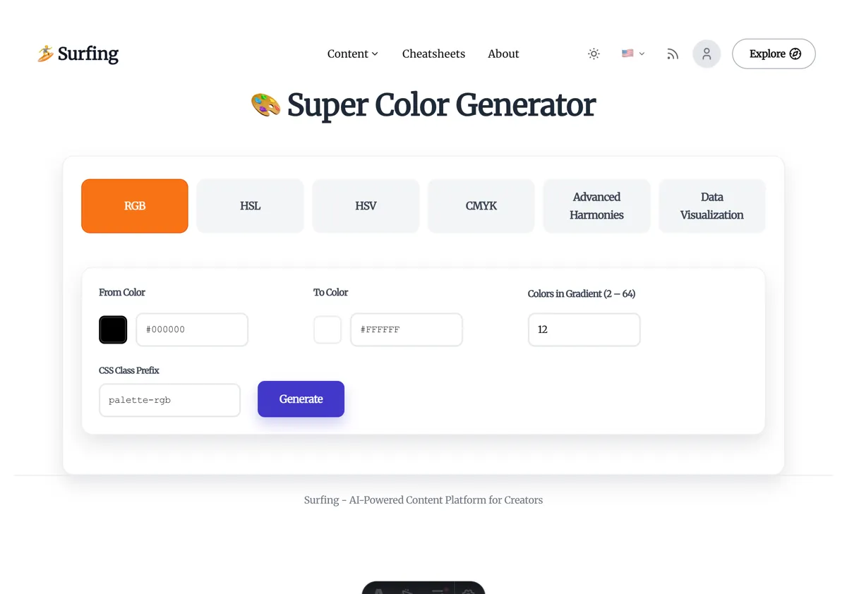
The theory above outlines the variables you need to watch. Surfing’s Super Color Generator was designed to bring those variables together in one interface so designers, developers, and data-visualization engineers can explore, calibrate, and export colors side by side.[8] Whether you’re copying a Figma palette or upgrading design tokens to wide gamut, the tool keeps the workflow tight.
Here’s how it connects the dots.
1. RGB/Hex Gradient Panel: Smooth the Steps Before You Write CSS
- Problem it solves: Generate gradient sequences from two endpoints, adjust segment counts, and verify smooth transitions before touching code.
- Core experience: Start/end colors, segment count, and class-name prefixes share the same screen. Outputs include hex arrays, CSS classes, and copy buttons.
- Best for: Background gradients, chart scales, button hover ladders, and slide backgrounds. Dial it in here, then paste back into your design system or presentation template.
- Tip: When the gradient has many stops, check whether luminance is linear. If needed, drop the generated hex values into a LAB/LCH tool to inspect ΔE.
2. HSL/HSV Panel: Keep Hue Aligned While Tweaking Lightness
- Interaction: Pick a base color, adjust hue step, saturation, and lightness/value. The tool renders a row of swatches and supplies
hsl()or hex values. - Developer bonus: Perfect for theming, hover/active/disabled states, or JavaScript logic that computes colors on the fly.
- Extra value: HSL output plugs straight into CSS variables, and HSV results convert to RGB/hex in one click—no manual math. Slide creators can instantly produce tiered palettes for headings, subheads, and highlights.
3. CMYK Panel: Predict Whether Print Can Handle It
- Enter CMYK values to see the matching hex code and check whether the color falls outside common printer gamuts.
- If you manage brand sites or marketing pages and also need printed collateral, running colors through this panel keeps the design from falling apart offline.
4. Advanced Harmonies: Auto-Generate Harmonious Palettes
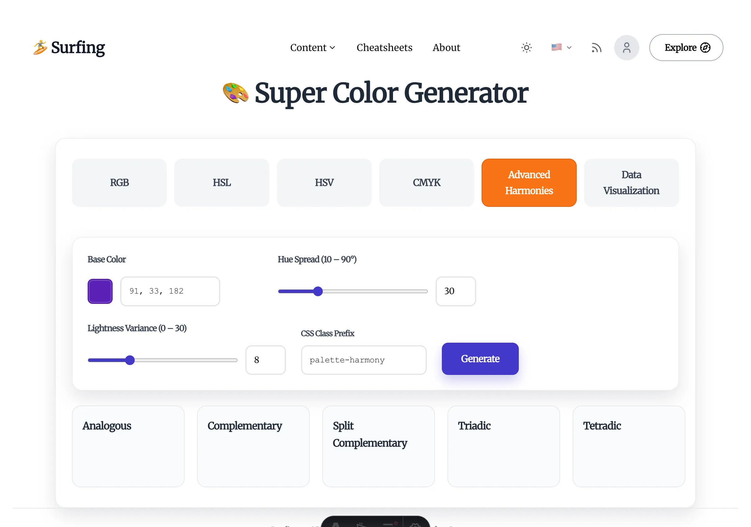
- Coverage: Supports analogous, complementary, split, triadic, tetradic, and other harmony rules.
- Why engineers care: When you need a quick MVP look without a dedicated designer, harmonies provide a reliable palette instantly.
- Pro tip: Combine the exported colors with CSS variables—
--color-primary,--color-accent, and so on—to slot them into component libraries or presentation themes.
5. Data Visualization Presets: Color Emergency Kit for Charts
- Generates Sequential, Diverging, and Qualitative palettes in one shot, complete with usage notes.
- Working with ECharts, D3, or BI dashboards? These palettes prevent rainbow chaos and stay color-blind friendly.
6. Code Export, Class Prefixes, Copy UX
- Every panel lets you customize class-name prefixes such as
palette-brand-100, making it easy to adopt in Tailwind or proprietary design-token systems. - One-click copying for CSS and JSON accelerates drops into component libraries or Storybook.
- If you script automation, treat the exported JSON as source data and wire it into your build pipeline.
7. Color-Vision Simulation & Print Warnings: Sanity Checks Before Launch
- Color-vision simulation: Supports deuteranopia, protanopia, and more. Ideal for verifying charts and status labels before shipping, and for ensuring presentation decks stay legible.
- CMYK warnings: A warning means you need a print-safe fallback—don’t wait for the shop to call you back.
8. Suggested Collaboration Workflow
Whether you’re collaborating as a team or working solo, try this “role + action” flow:
- Brand and UI designers: Annotate primary and semantic colors in Figma or Sketch, and flag whether you need Display P3, CMYK, or projector-safe palettes.
- Frontend engineers: Rebuild gradients, state colors, and chart palettes in the Surfing tool, then export CSS variables or classes.
- Data visualization/BI engineers: Use harmony and data-viz modes to generate chart palettes, toggling color-vision simulation to check perception differences.
- Slide and presentation creators: Calibrate Keynote/PowerPoint palettes according to the venue’s gamut, and rely on CMYK warnings to anticipate cross-medium behavior.
- Full-stack or indie developers: If you don’t have a design partner, explore directly in the tool, export assets, and refine later with helpers like
color-mix(). - Final QA: Run color-vision simulation, contrast checks, and CMYK warnings as a last-mile sanity pass. Export print-ready swatches for marketing when needed.
Closing Thoughts: Treat Color Systems as Engineering Assets
Color work isn’t mysticism, nor is it only a designer’s aesthetic duty. When frontend developers understand a handful of models and wield the right tooling, visual specs land consistently and color standards can become a reusable team asset.
Make Surfing’s Super Color Generator part of your routine: align on requirements, generate code during development, and run accessibility checks before launch. Over time your color system becomes easier to maintain—and far more professional.
Share this article with teammates, or host a workshop to get everyone comfortable treating color as an engineering topic.